


Ever what what you’re doing wrong with your landing pages?
Or find yourself staring blankly at the screen wondering what you should put on there to get leads?
We’re going to answer both of these questions today so you can feel more confident in your current pages and capture more leads every day.
Before we take a look at an example of an optimized, lead-generating landing page, let’s figure out what doesn’t help your conversion rate.
Information Overload
Don’t overwhelm your viewers with too much info. Text, design, images…too much of a good thing makes it an inconvenience.
And if your visitors feel overwhelmed or are forced to dig for the actual value, you’re going to lose them right there.
The Fix?
Simple = Sales
You want to make it easy for your visitors to opt-in.
This means no elaborate designs, lengthy descriptions, or competing images.
Keep it simple and be straightforward.
The quicker your lead enters their info, the quicker you can convert them.
This is actually a simple test Google puts all of their websites through. They stand back and see if it’s easy to find the button.
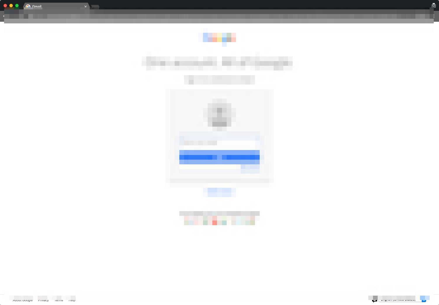
Do you see how easy it is to find the button on this landing page, even though it’s blurred out?
Bad Calls-To-Action
A huge flaw in your lead-generating systems is going to be a buried or non-specific call-to-action.
Again, simple = sales.
You need to make it as easy as possible for your leads to provide their contact details AND submit them.
Use color, bold text and a catchy, attention-grabbing word or phrase for your CTA.
And, most importantly, present it clearly.
Headline
An irrelevant or poorly written headline can be just as detrimental as a poor call-to-action.
While your call-to-action button is your conversion source, your headline headline is the very thing that will keep them on the page.
You still read the newspaper, take a look at it now and check out the headlines.
If not, take a few minutes to watch this video and complete the activity we recently came up with to improve your headlining and copywriting today.
So, does a high-converting landing page look like?
Let’s check-in with LeadSite customer and superstar Salt Lake City agent Dustin Brohm to find out.
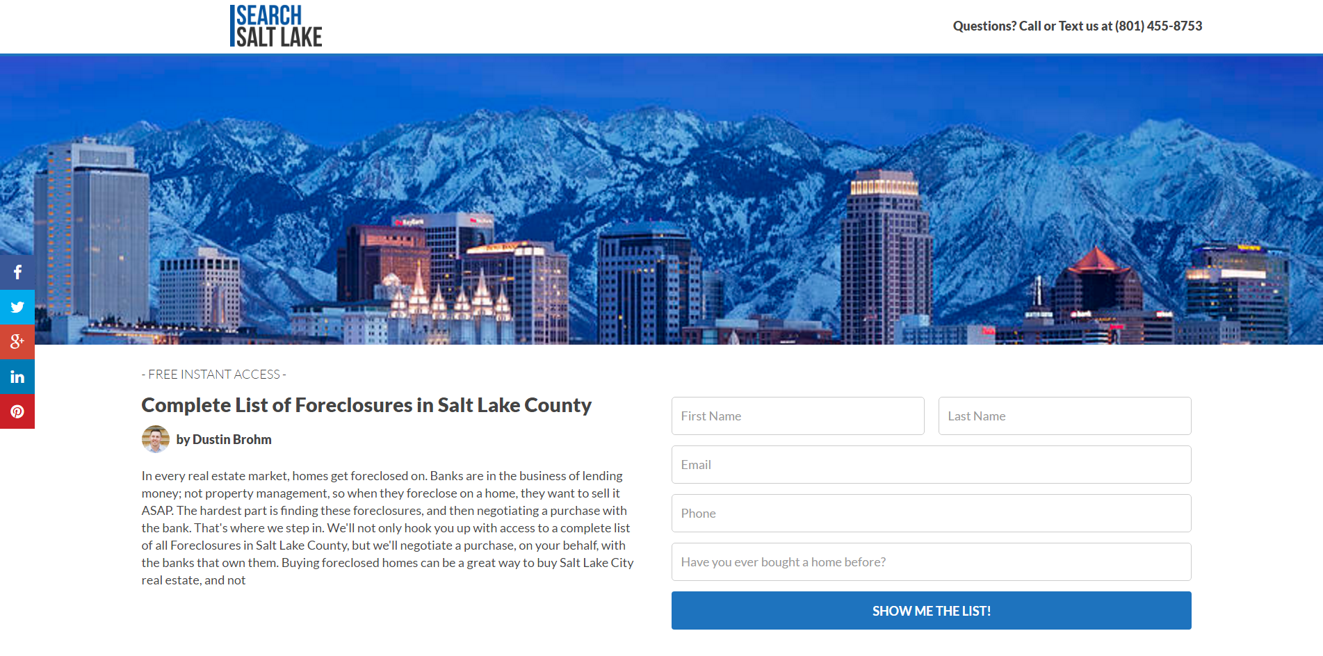
Dustin’s getting solid leadswith this page.
What makes it stand out?
Starting at the top…
Dustin’s contact info is clearly provided in the upper right hand corner.
No matter how much other info you’re including on landing page, you need to have your contacts details readily available.
The next thing to glance at is his banner image.
It’s clean, professional, polish and gives a stunning visual of his area.
And because it’s so strong, it’s going to help visitors trust him and his site.
Now, take a look as the headline.
And that’s all I have to say because you can find it immediately.
Right away we know what Dustin is providing and are going to be ready to opt-in to gain access to a complete list of foreclosures.
Dustin includes nearly a paragraph under is header to further explain the free list he’s providing, but the way his page is setup makes this info optional to read.
And this is a perfect example of how to give more details without overwhelming your viewers.
Lastly, we see his CTA button.
It’s perfectly located so once a viewer enters their details all they have to do is click it and they’re in.
Dustin created this landing page with Squeeze.
Squeeze is one of the many apps we offer LeadSite customers that lets you totally customize landing pages in seconds.
Definitely tune into the video above to see Squeeze in action and subscribe to Easy Agent Pro on Youtube for our ongoing Back to the Basics series happening now!
Once you’ve got your landing page setup, you need to get traffic to it.
You’ll need to determine your largest traffic sources, but changes are the two big ones are your blog and Facebook page.
This LeadSite user chose to promote his landing page to his Facebook audience with this ad post.
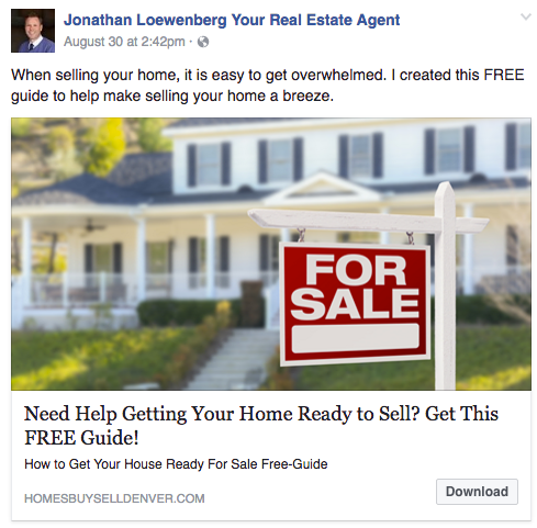
Anyone who clicks through to his page from this ad will know exactly what they’re opting-in for.
You can also simply post a related image with your CTA text and then boost it.
But if you’re ready to target your audience even further, read this post on Facebook Ads For Real Estate: A Step-By-Step Guide.